These days, it seems like we’re constantly barraged with images of what’s fresh and hot in home design. From Instagram to Pinterest to “Fixer Upper,” it can be hellishly difficult to keep up with the latest trends—and very easy to feel like your home simply doesn’t stack up.
But here’s the thing: Those gorgeous photos of, say, spotless, all-white kitchens are more than merely aspirational; they’re a bit antithetical to, you know, living.
So before you fork over a ton of cash to make your home look Pinterest-worthy, remember that some of the hottest design trends are also a whole lot more trouble than they’re worth. Like with a beautiful dry-clean-only cashmere sweater, proceed with caution when trying these trends on for size.
1. Marble countertops
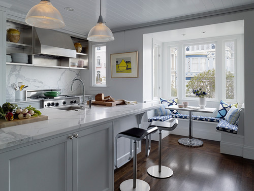
Photo by JKA Design
Sure, the popular (and pricey) Calacatta or Carrara marble countertops are beautiful—but they’re also highly impractical.
“Using marble in the kitchen is like installing a white sponge on top of your cabinets,” says Gretchen Kennelly, an interior designer in San Diego.
Why? It’s extremely porous, meaning it will etch or stain if you spill anything acidic or leave water standing on it for too long.
If you want your countertops to look the same in 10 years as the day they were installed, opt for a more sensible solid-quartz version (e.g., Silestone or Dekton) at half the price.
“The No. 1 thing my clients want when it comes to countertops is durability and a material that requires zero maintenance,” says designer Daniel Germani. “They hate the idea of investing in something that will inevitably stain or requires constant sealing.”
2. Metal tiles
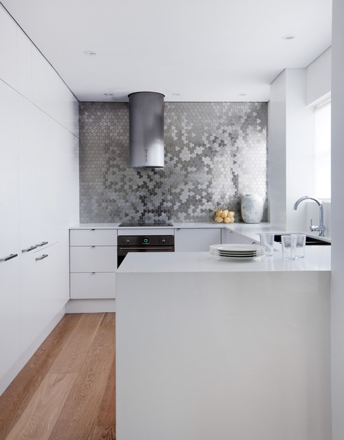
Photo by ALLOY Solid Metal Tiles
Metal is making a big splash this year, designers say, as homeowners turn to tiles in soft shades of silver and brass to add glamour, or simply to complement the matte fixtures that are dominating in 2018.
The problem?
“While they’re gorgeous,” Kennelly says, “from a maintenance standpoint, they’re a little tricky.”
If you’re in a coastal environment, salt in the air could cause rusting (yes, even indoors). And water left remaining on the tiles for an extended period of time could accelerate tarnishing, according to Kennelly.
The takeaway: Skip them in the shower, but consider using them for an accent wall or in a small, dry space for texture.
3. All-white (or light-colored) decor
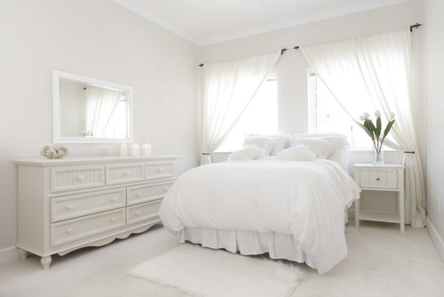
Photo by Houzz
White, light grays, and creams are all the rage right now for sofas, chairs, area rugs, and even bedding. And it’s easy to see why—who doesn’t want that pristine, crisp look that makes you feel like you’re living on a cloud?
But over time, those light fabrics are prone to stains and overall dinginess. And then you’re left with potentially exorbitant cleaning and maintenance costs.
An all-white look “is super easy to do as long as the inhabitants of the house don’t actually live there,” says Justin Riordan, founder of Spade and Archer. “Do you see the conundrum?”
“Unless you are a neat freak, have no kids or pets, or have slipcovers, opt for more medium to dark tones and use light-colored pillows for contrast,” adds Erin Davis, lead designer at Mosaik Design & Remodeling in Portland.
4. Dining benches
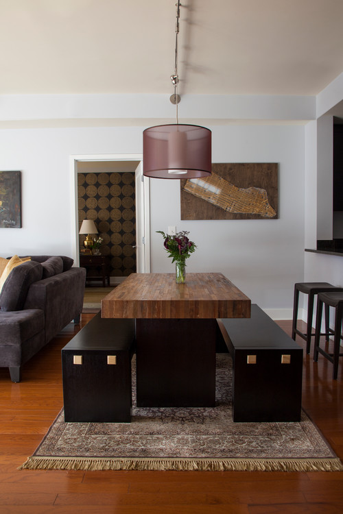
Photo by Jenny Madden Design
Dining benches are fairly ubiquitous these days, thanks to the continued popularity of farmhouse chic. They have a nice, low profile and lend a welcoming vibe to your dining room.
The problem(s)?
They’re “great until the guy in the middle has to go pee—then everybody needs to get up,” Riordan says. “And oh yeah, did I mention that you’ll need to see a chiropractor after sitting through an entire meal on one of these things?”
5. Peel-and-stick laminate accent walls
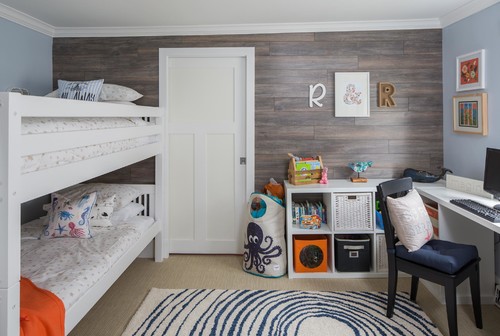
Photo by Megan Leith-Menard Interior Design
“If you’re considering an easy accent, Pinterest may have drawn you to peel-and-stick, wood-look laminate,” says designer Kayla Hein, creative director for Modern Castle. “But proceed with caution. (It’s) inexpensive and easy to install … but it’s difficult to uninstall when the trend goes away.”
Taking it off involves more of a “peel-and-rip approach,” Hein explains. The adhesive used for laminate is quite durable, so it’s likely you’ll take some wall off with the laminate as you remove it. (Not so with peel-and-stick wallpaper, which pros say tends to be easier to remove.)
If you insist on giving this tile trend a try, put it in a lower-traffic area, Hein advises, or be prepared to do some drywall repair.
6. Slipcovers
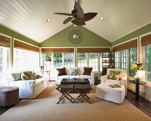
Photo by Olga Adler
We’re not talking about the frumpy ones your grandmother used. In the era of easy-breezy farmhouse chic, slipcovers are enjoying a comeback, complete with fresh, tailored designs that also offer the benefit of easy cleaning.
But some design experts are dubious that slipcovers ever make things as simple as they look.
“The thought here is ‘I can just slip these off, wash them, and then slip them right back on, voila!'” Riordan says. “The truth is you will spend the entire rest of your life getting these stupid sheets to lay flat on your sofa or soft chairs. As soon as somebody sits on them, they look terrible.”
Instead, invest in a good upholsterer, Riordan recommends.
7. Wall stencils
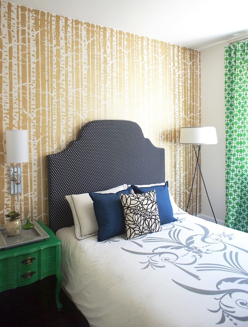
Photo by Janna Makaeva/Cutting Edge Stencils
At first blush, stencils seem like an inexpensive way to add visual interest to walls. But things can devolve rapidly. For a stencil to look good, the pattern has to be perfectly aligned and the hand absolutely steady; anything less is a recipe for design disaster.
“Your home isn’t intended to be an arts and crafts project,” Hein says. “Wall stencils are for kids, and can be a royal pain in large scale. You have to have an unbelievable amount of patience—one wrong stroke, or if you get lazy and lift the stencil even slightly, your whole pattern will look off.”
8. Unusual flooring materials
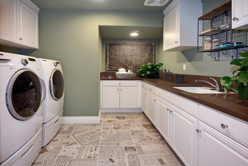
Photo by Warmington Residential
Pinterest, you’ll be the end of us. DIYers on the site are really into using unusual materials such as old pennies, paper sacks, or recycled newspaper for flooring. (Seriously: People are taking their pennies, laying them on the floor, and sealing them with layers or epoxy or resin.)
What could possibly go wrong?
“Flooring is intended to be ultradurable and should be made to last for many, many years,” Hein says. “If done incorrectly, this approach can cause your floor to crack, bubble up, or fail in other ways.”
For high-traffic spaces in particular, shell out the necessary cash for a better, more lasting solution.
Original Source: https://www.realtor.com/advice/home-improvement/8-hot-but-impractical-design-trends/
Original Author:
Original Date: Mar 28 2018
